XENO-79
Typographic Poster ft. Adobe Photoshop, Illustrator
“Alien” is a very popular horror sci-fi franchise, with the original film that I am focusing on taking place in 1979. A few movies have released since then, but none provide the same eerie feeling as the original.
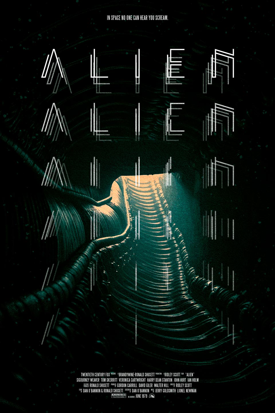
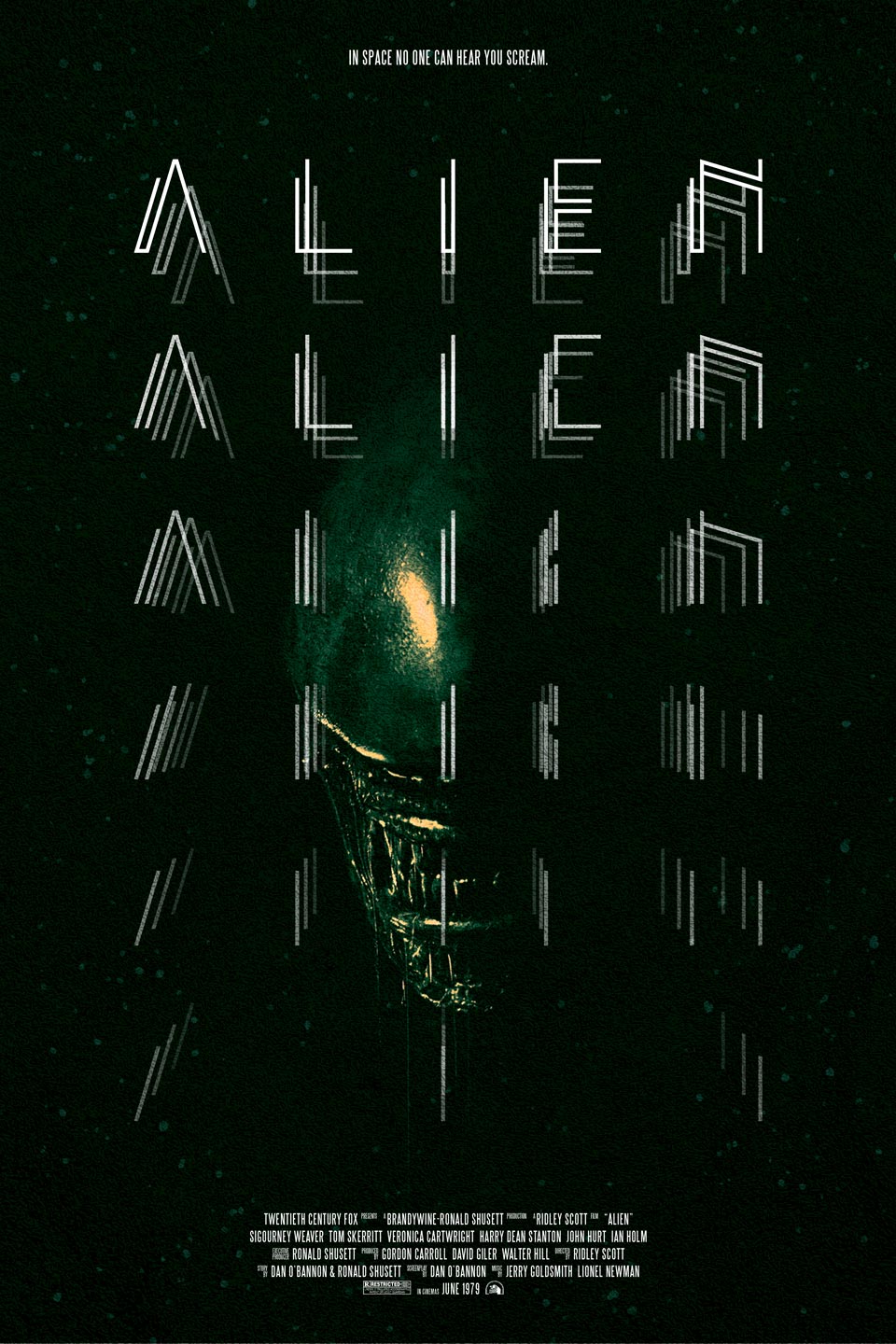
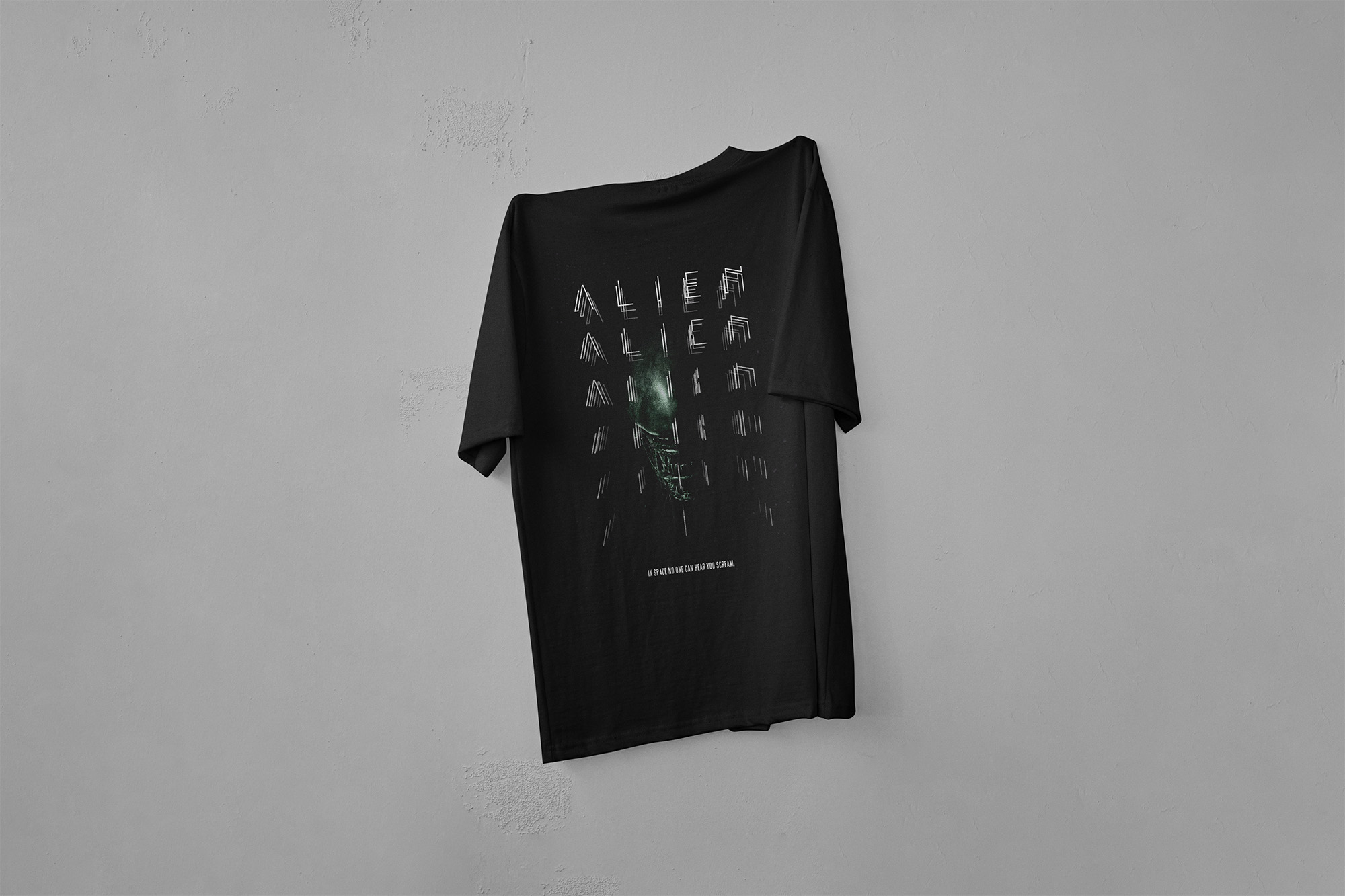
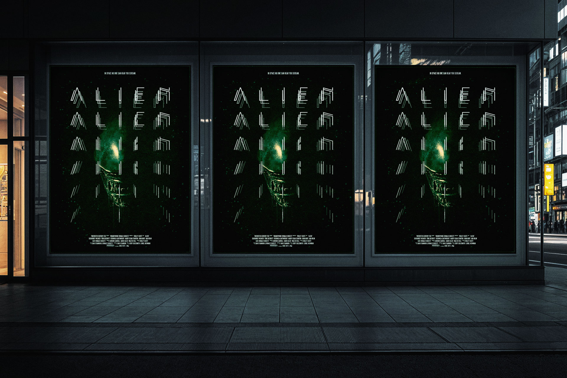
This project is focused on the creation of a brand-new typeface, XENO-79. The challenge with this project was to create a visual language that feels worthy of the franchise and portrays the chills the viewer experiences through the films. To bring it all together, I created a slim and uneven sans-serif font for the main title, and two poster iterations that feature spine-tingling visuals from the films.
THINKING STRATEGY
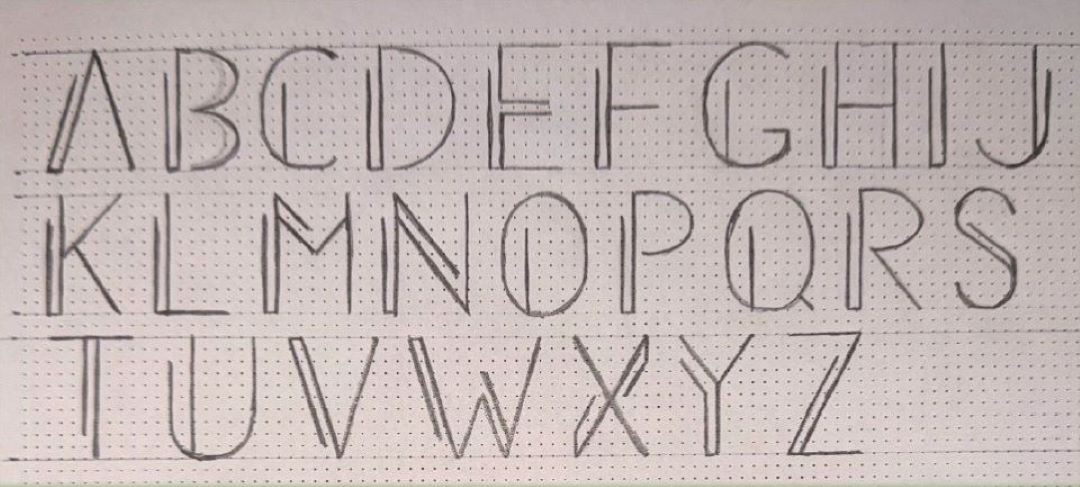
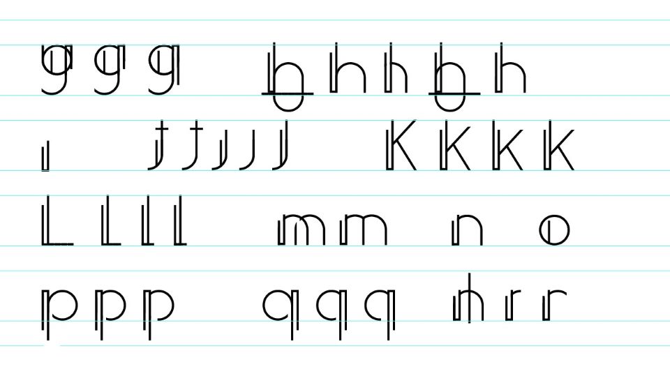
XENO-79 begins with experimentation. I began with rough process sketches to play around with the letterform shapes. Rough sketches were translated into the digital stage on Illustrator for the next trial stage, where it was vital to maintain the geometric shape of the letterforms while experimenting.


COMPLETED TYPEFACE
Ensuring I maintained the same set of rules throughout the building process, I chose my completed alphabet, with uppercase, lowercase, and numbers/symbols. The thin letters with the strange, uncentred extra stroke embody the organism from the film and its overall feel of perfect imperfection.

FINAL PRODUCT
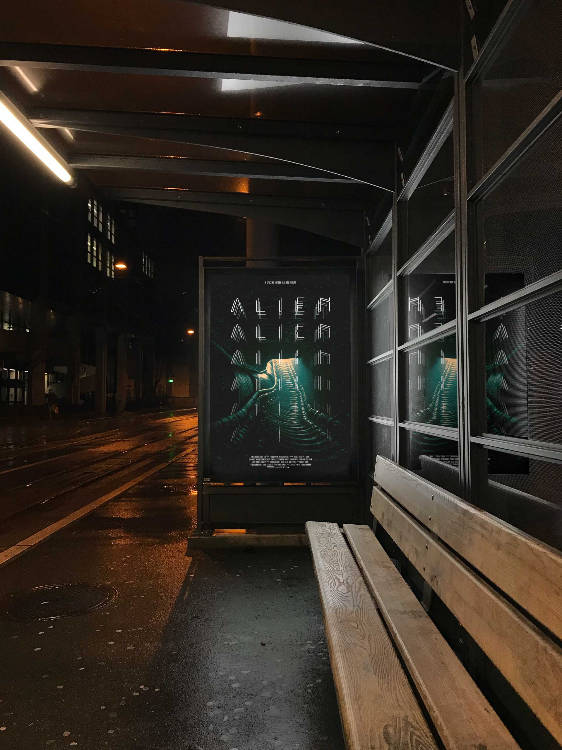
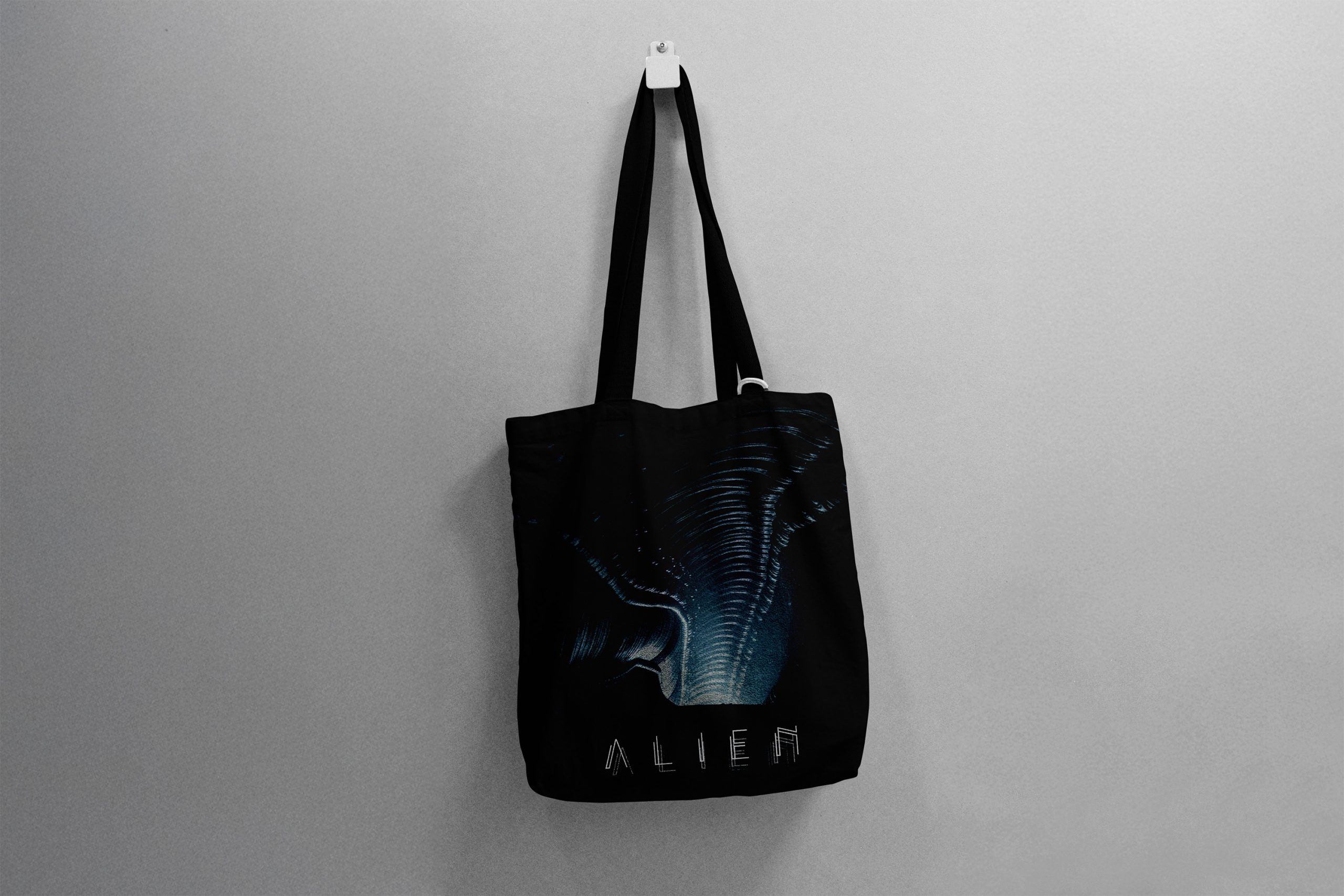
With a settled typeface having been chosen, putting it all together felt natural. XENO-79 is laid out in a galactic grid that pairs with the dark and sinister visuals of the film, featuring an ominous corridor and the Xenomorph himself. The composition of both posters alludes to the aforementioned themes of horror, and with it brings to life a modern take on the visual language portrayed by the original film.