Phantom Games

Branding Campaign ft. InDesign, Adobe Photoshop, Illustrator

Phantom Games is a conceptual video game studio developed to explore how psychological horror can be communicated through visual identity. This project focuses on a horror atmosphere and ambiguity as its primary design tools.

The goal was to build a brand capable of supporting multiple game titles that maintain a consistent tone of tension and unease. A key challenge was positioning the brand within a different seasonal setting. This was the foundation for developing a summer campaign that intentionally challenged the seasonal expectations of the fall/winter seasons typically associated with the genre.

This project features the promotion of the brand’s summer campaign and its first game release, “Midnight Row”. The game manual hopes to expand on the world of “Midnight Row” and introduce the audience to its setting, characters, and overall worldbuilding.

A mockup cover that reads "Midnight Row" on a dark billboard mounted on the side of a dark shipping container with a white light shining just above.

COMPANY BRANDING

My design approach for the company’s branding looks to use minimal composition and high contrast to bring attention to its glitchy, visual disruption. I look to prioritize the negative space and the tension on the typesetting to portray the feel of unease.
Gaming company logo that reads "Phantom Games" in white, with the company logo between the two words on a dark background
Gaming company logo that reads "Phantom Games" in dark, with the company logo between the two words on a white background
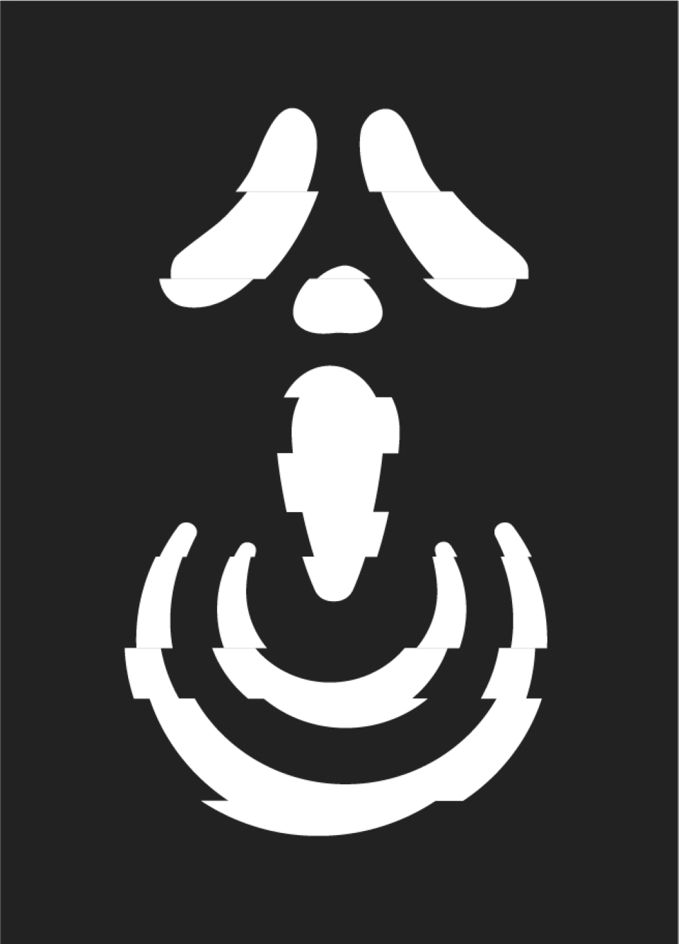
"Phantom Games" company icon, a combination of a joystick and the ghostface mask with a glitch effect, dark on white
"Phantom Games" company icon, a combination of a joystick and the ghostface mask with a glitch effect, white on dark

SUMMER CAMPAIGN

The summer campaign at Phantom Games aims to bring in sales and a broader audience that only expects horror universes to be at their best around the fall. Who says Halloween can’t come around a bit sooner?

The aim is to release a new game at a time of year when the market is less crowded, to stand out and attract players looking for a horror fix that typically will not be released for another few months. Engagement comes from the following promotional posters for the game cover, a summer campaign poster, and a few “missing” posters to arouse suspicion and curiosity.
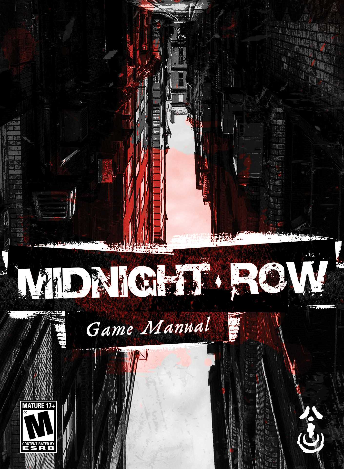
A game cover that reads "Midnight Row" in white text on a black, red and white style creepy grungy alleyway.
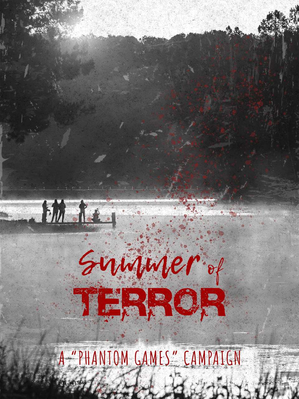
Campaign poster that reads "Summer of Terror" in a red horror-style font, with the subhead reading "A Phantom Games campaign" in a thin-stroked red font, on a light grey/white filtered camping lake with a group of friends out in the background on a pier.
Portrait poster that reads "Missing", followed by the image of a long haired woman, followed by the name "Camille Reyes", and smaller information relating to her disappearance.
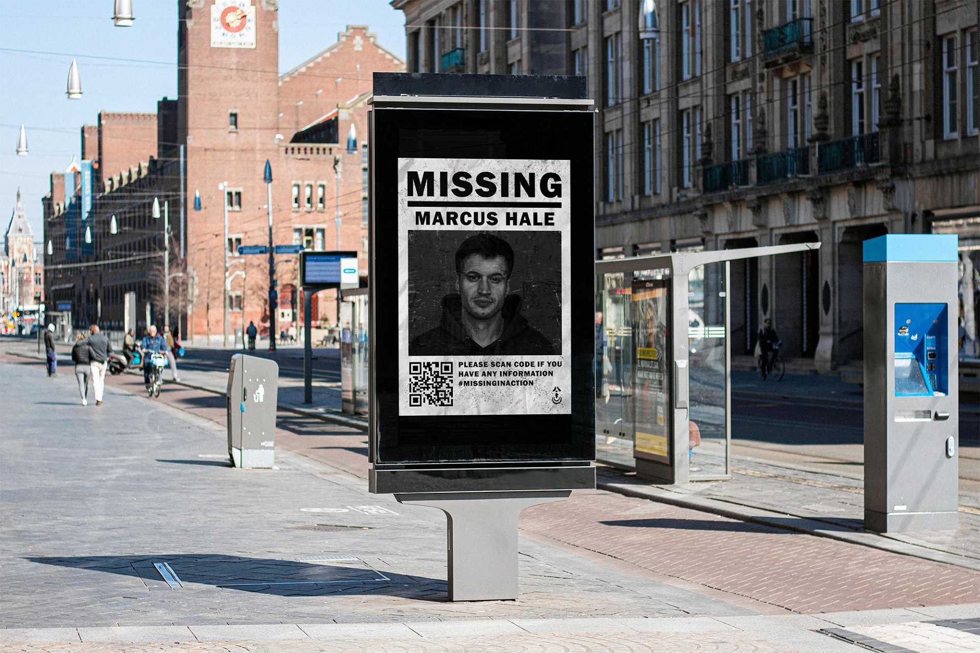
Mockup billboard in a city centre during day time of a portrait poster that reads "Missing", followed by the image of a short haired man, followed by the name "Marcus Hale", and smaller information relating to his disappearance.
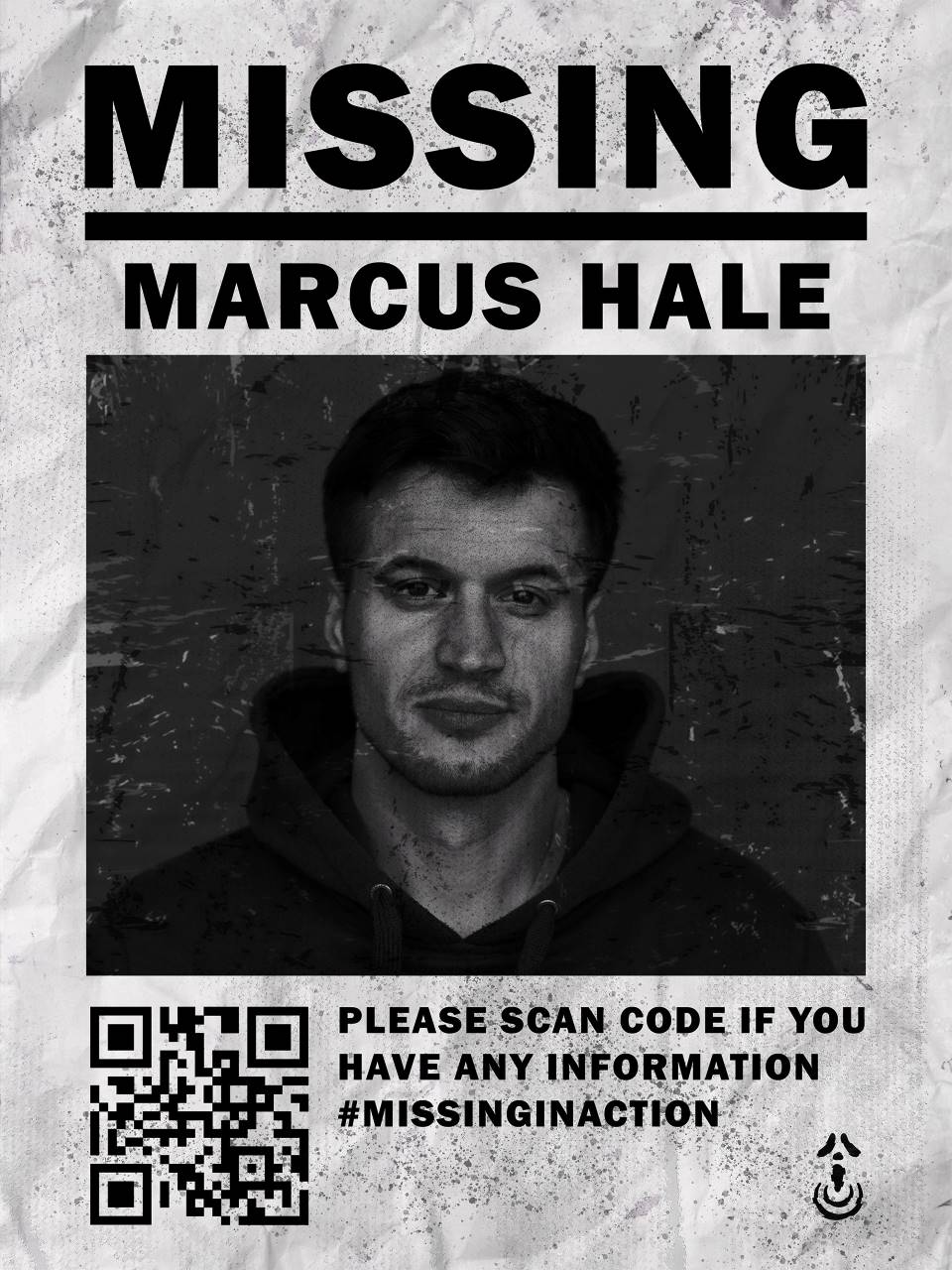
Portrait poster that reads "Missing", followed by the image of a short haired man, followed by the name "Marcus Hale", and smaller information relating to his disappearance.
Billboard mockup on a steely grey background of a campaign poster that reads "Summer of Terror" in a red horror-style font, with the subhead reading "A Phantom Games campaign" in a thin-stroked red font, on a light grey/white filtered camping lake with a group of friends out in the background on a pier.

GAME MANUAL

The game manual aims to be ominous and creepy, setting the tone for the main gameplay. I want the player to feel unsettled all the way through. It promotes Phantom Games’ identity as a developer of psychological horror experiences that rely on storytelling and immersion.

I drew inspiration from nostalgic game manuals from the 2000s, when media was still very much physical. Horror game manuals had so much personality and love poured into them, and I wanted to bring that feeling back for games that have slowly been slipping away from us.
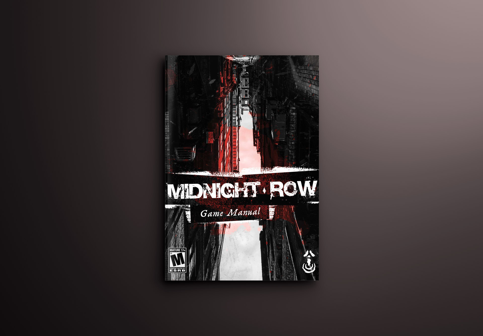
A mockup cover that reads "Midnight Row" on a dark, flat background. Just a hint of white lighting from the top right corner.
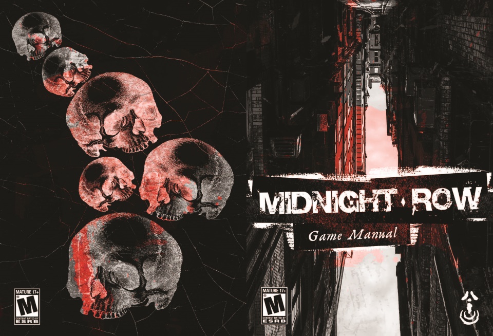
"Midnight Row" game front and back cover, spread 1
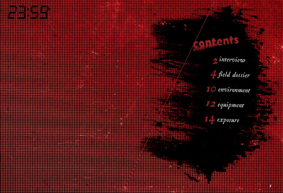
"Midnight Row" contents page, spread 2
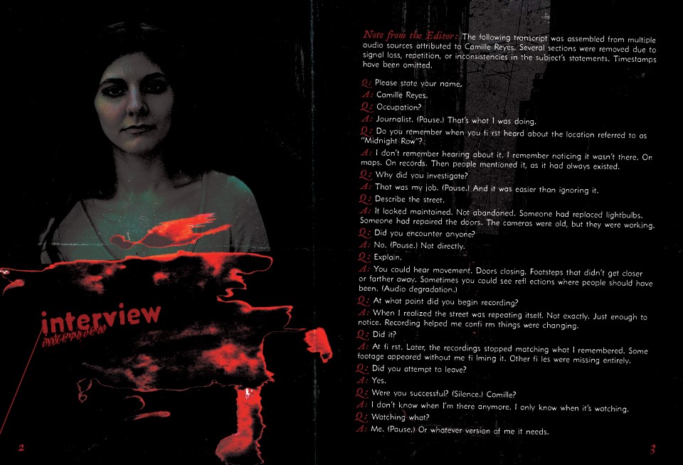
"Midnight Row" interview page, spread 3
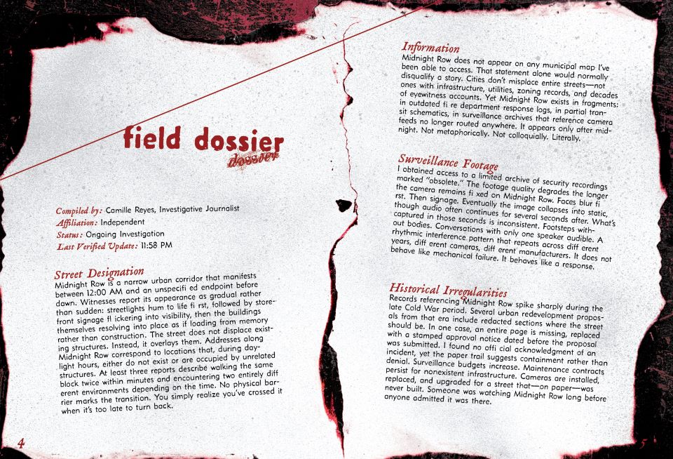
"Midnight Row" field dossier page, spread 4
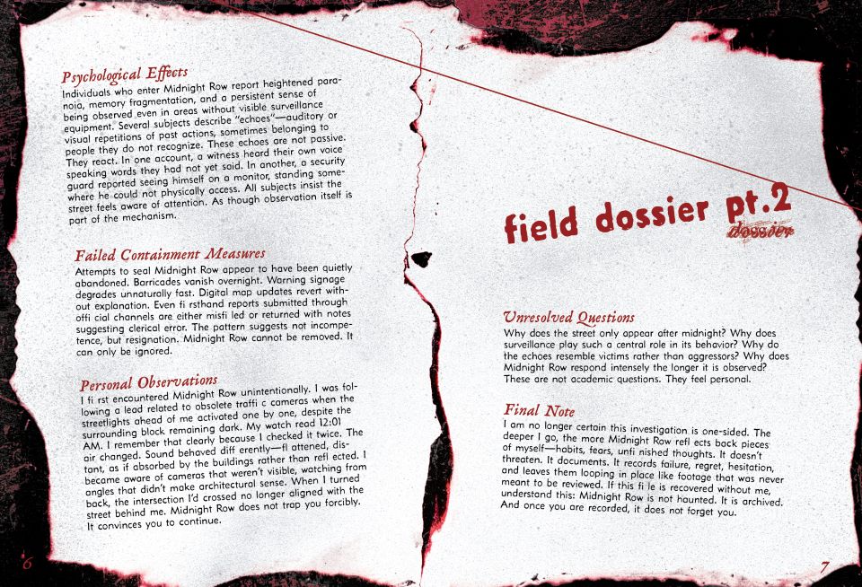
"Midnight Row" field dossier page continued, spread 5
"Midnight Row" art page, spread 6
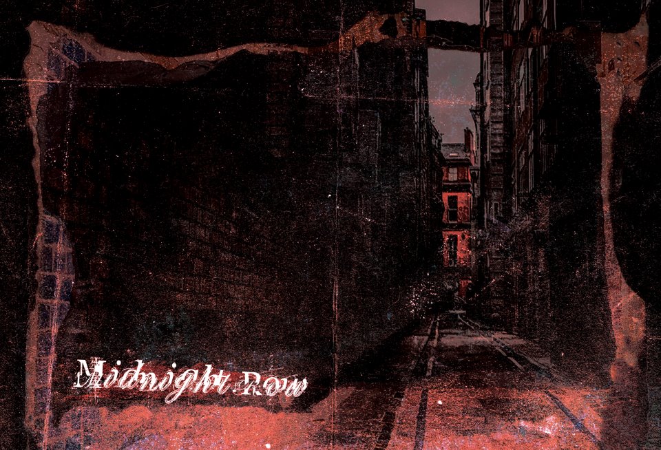
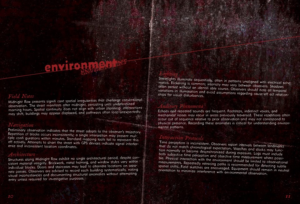
"Midnight Row" environment page, spread 7
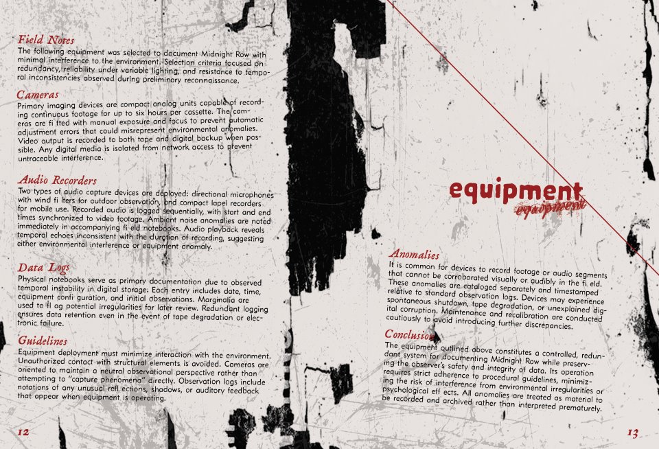
"Midnight Row" equipment page, spread 8
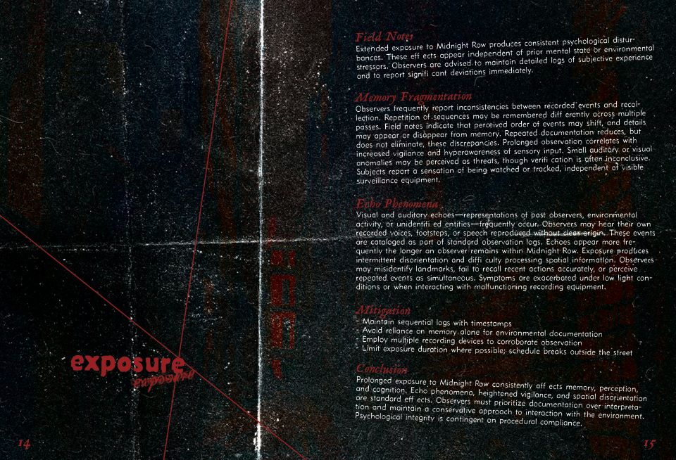
"Midnight Row" exposure page, spread 9
"Midnight Row" back page, spread 10
"Midnight Row" game manual mockup, featuring the back cover dark skull art and the contents page spread.