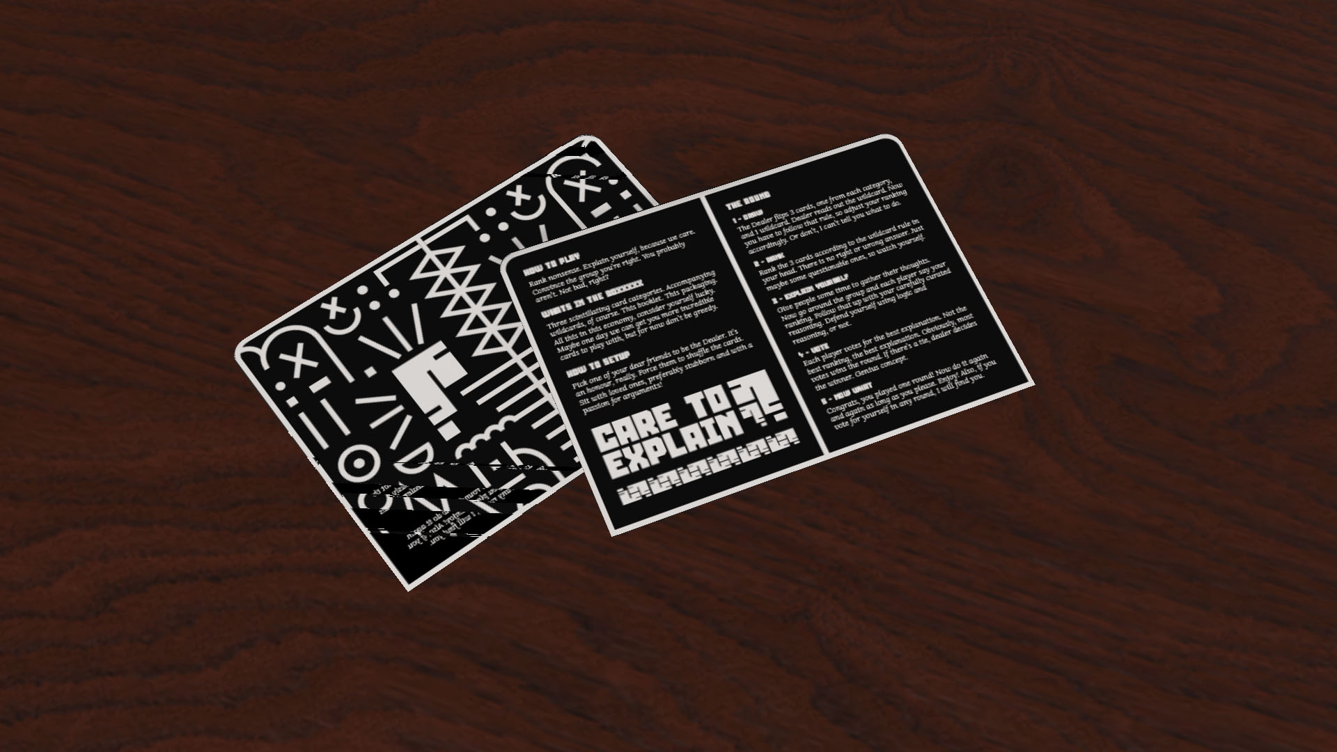
CARE TO EXPLAIN?
Party Card Game ft. Adobe Illustrator, Dimension
This project is a party card game where players rank absurd prompts. There are no right or wrong answers. The outcome is decided only by the players and how they choose to interpret the wildcards provided. The goal is to bring about good fun times between friends and families anytime.
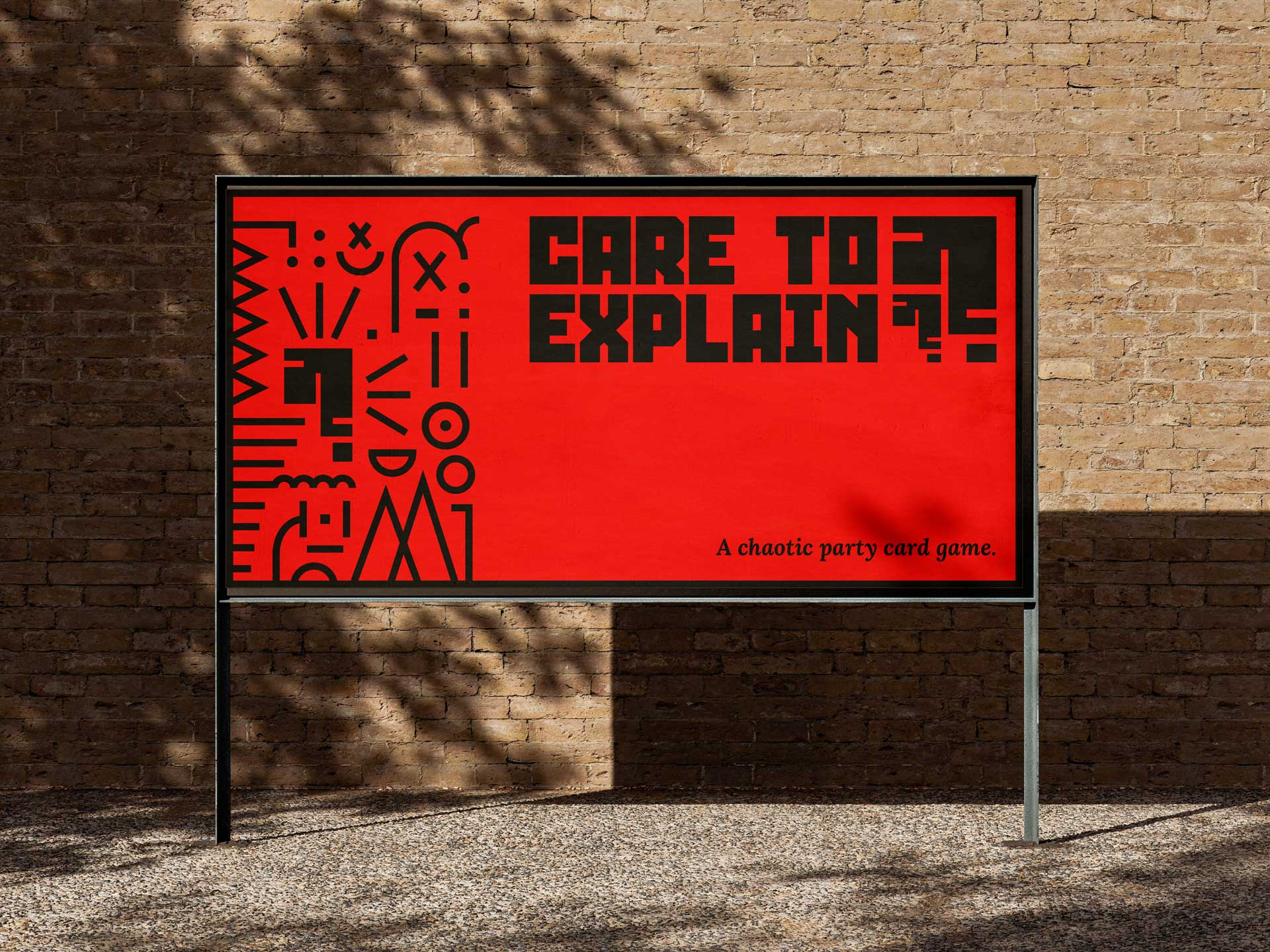
The scope of the project includes defining how the gameplay works, such as the different card categories and wildcards, as well as creating a visual identity for the game in line with the intended target audience. The deliverables will focus on different card layouts, colours, and type treatment, as well as their packaging and an instruction sheet, which will establish the project as a playable game and a portfolio project.
PROCESS WORK
My motivation to create this game is very simple. I love games. I especially enjoy games that involve being goofy and having a good time with friends and family. Cards Against Humanity is my favourite of this genre of games, but it can sometimes be a little too aggressive in its content for some people. I created “Care to Explain?” as a safer alternative to be more inclusive to that group of people while still maintaining the charm of this style of group game.
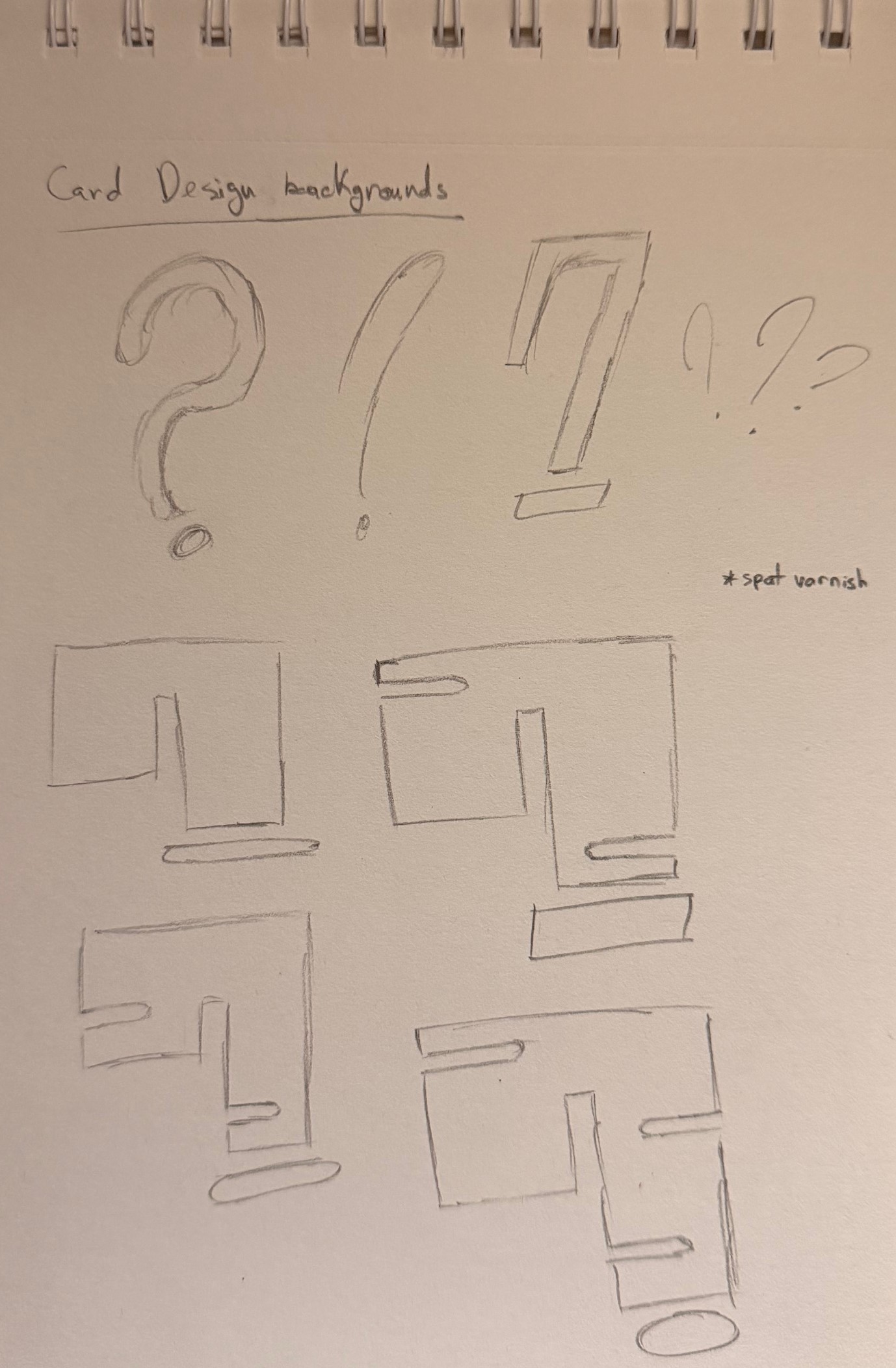
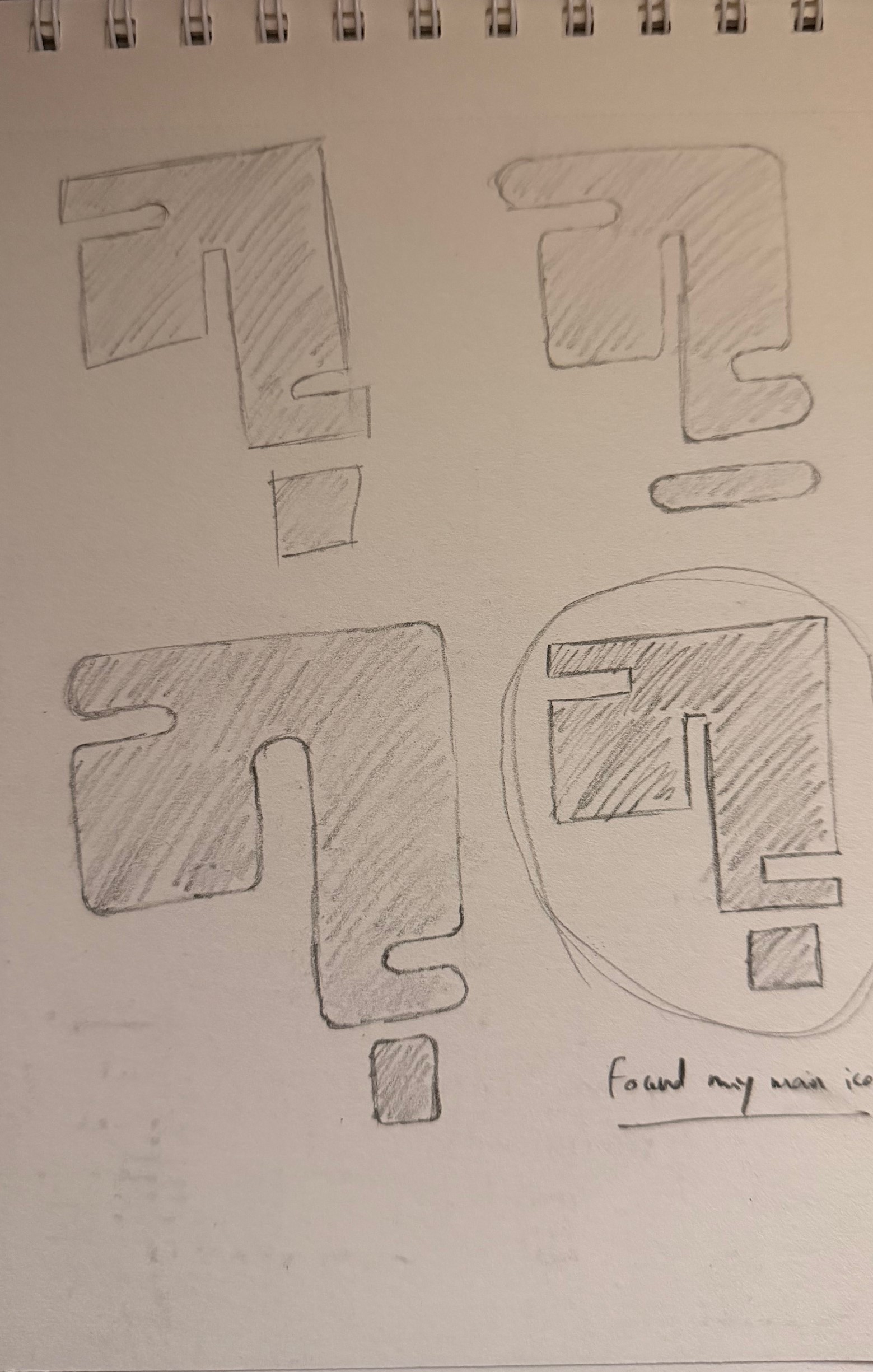
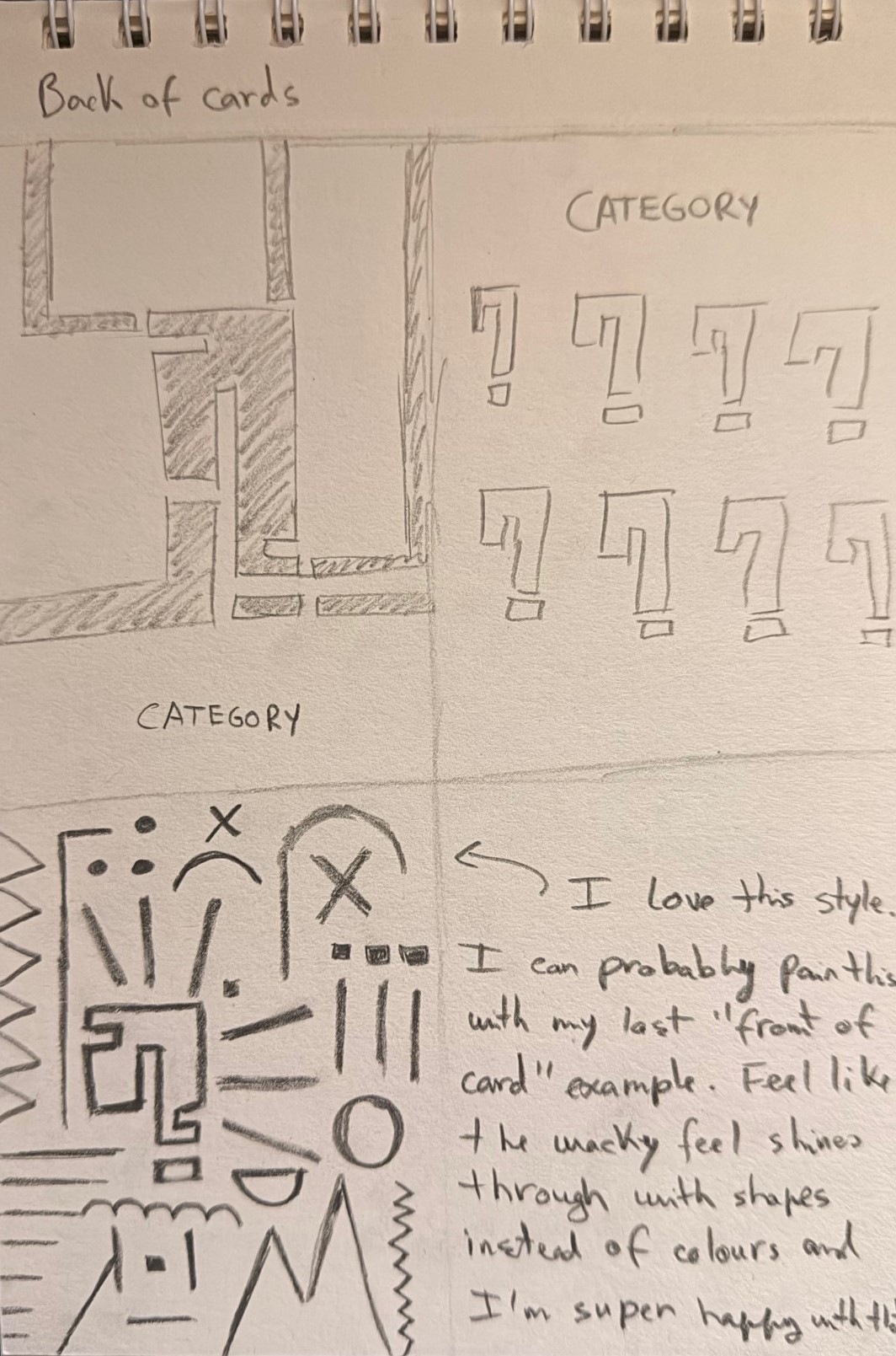
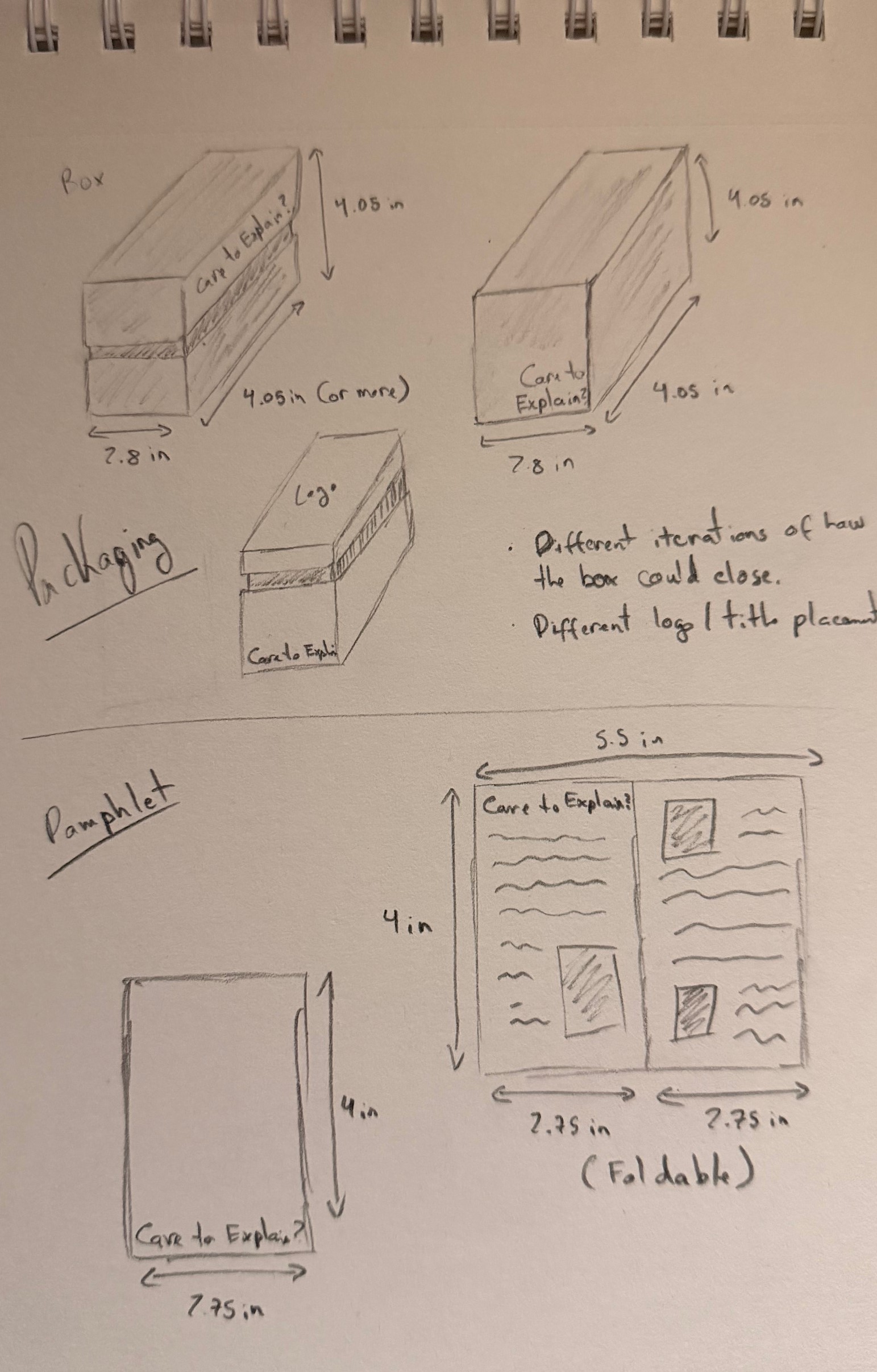
My process work started with sketching variations for the main logo, the box, and the artwork for the cards/instruction sheet. Once I found what I liked on paper, I moved to Illustrator and started to visualize things better digitally. After much experimenting, I settled on a style guide and used that to bring my cards to life.
GAME CONTENT
The gameplay side of this project took quite a bit of tweaking to reach the final stage. I thought about what sort of gameplay loop I could create that would be engaging, replayable, and enjoyable for a group of people.
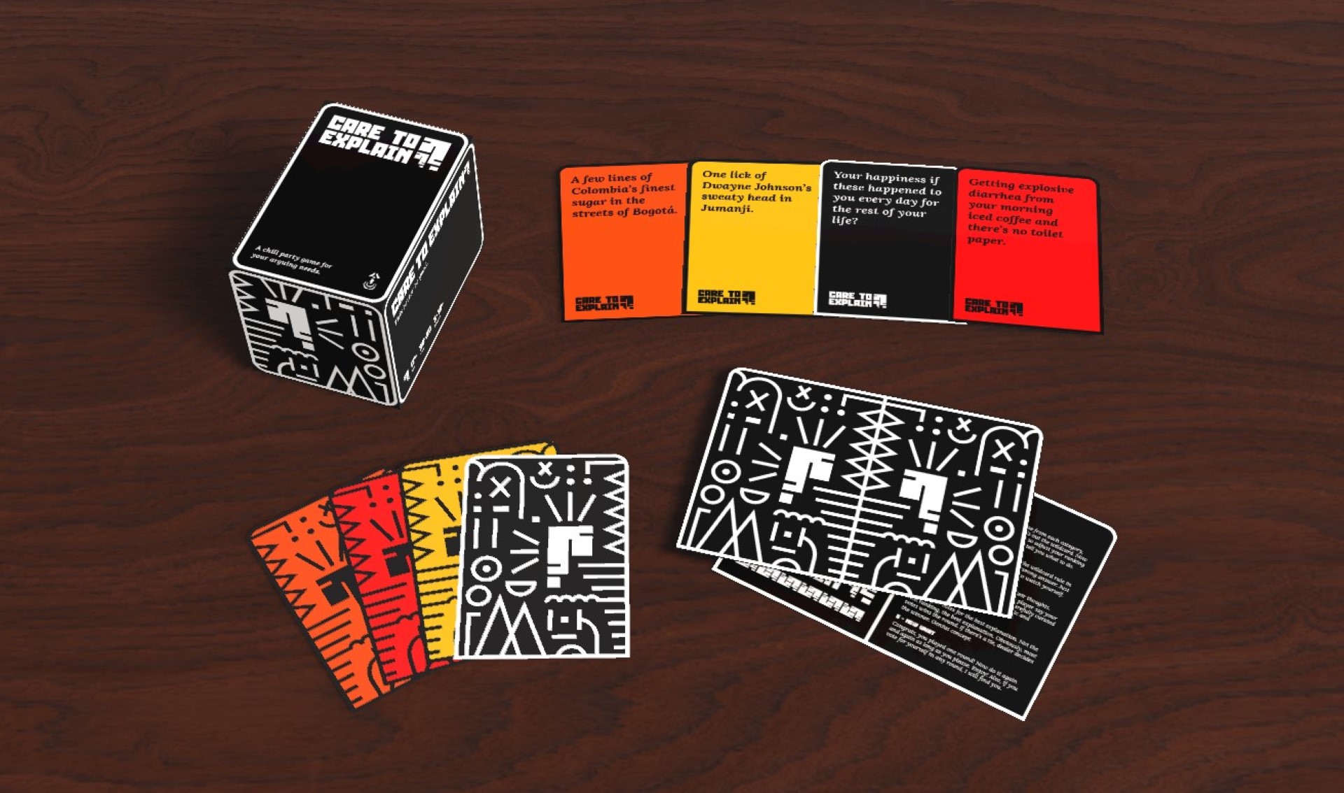
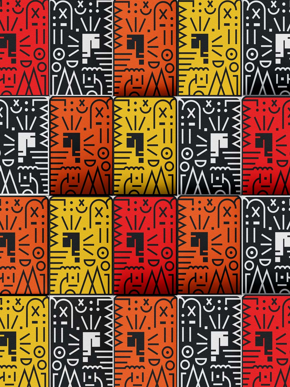
This is when I arrived at the current gameplay loop, where the players pick cards from a category (red, orange, yellow) and rank those cards according to a certain wildcard (black). This brings fun and chaos to the table and allows people to express their opinions on scenarios that they would never think about!

FINAL PRODUCT
Now, to bring it all together, the final step was to showcase it to the customers in a realistic manner. I used Adobe products to create the 2D versions of the content and upgraded them to 3D versions. Each object was brought to life in Dimension for marketing purposes to showcase to the customer what my game looks like.